Decor trends used to have basically nothing to do with renters. "Curved walls are in this year." "Arched doorways are back." Thanks — I'm not allowed to put up a nail.
But 2026 is unusual. Read through a few of the big year-ahead trend round-ups and the same theme keeps coming up: it's almost all about movable things — wall art, fabric, lamps, older pieces, colour. Which is to say, this year's trends were practically made for renters. This note translates the four key terms into a "no-drill version", and talks about how to borrow from a trend without being dragged around by it.
The short version
- The 2026 mood: quiet maximalism — rich layers, but curated, built from movable things. Naturally renter-friendly.
- Four ideas worth borrowing: curated walls, colour drenching, a warm earthy palette, and old pieces with some age on them.
- The line between maximalism and mess: one palette, a story behind each piece, and a bit of breathing room.
- How to borrow well: bring in one trend at a time, test with small things first, classic base and trendy surface.
- In a small flat, dial it back: the smaller the room, the lower the ceiling on "more".
One: quiet maximalism
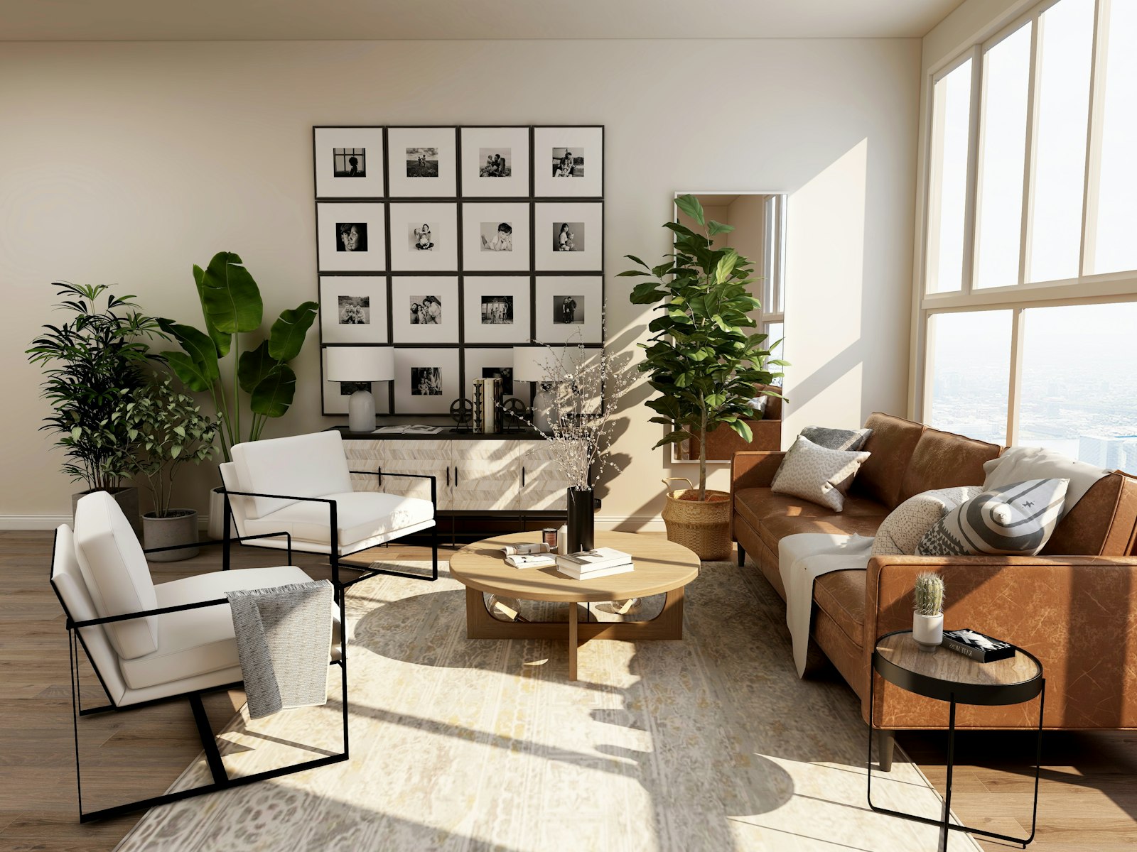
After a decade of minimalism ruling the decor world, the pendulum has swung back. The 2026 version of maximalism isn't "more is always better" — the words the magazines keep reaching for are curated and crafted. Curated more. The rough consensus among designers seems to be: layers and personality are coming back, but every layer should be a conscious choice, not the result of hoarding.
For renters the real gift here is legitimacy. You were never allowed to touch the walls or the floor anyway, so personality could only come from art, cushions, books, plants, lamps — the movable stuff. That used to be called making do. In 2026 it's called style. To tell whether you're doing maximalism or just making a mess, run three checks:
- A unified palette underneath. Lots of things, but the colours sit in one family (how to set a palette is in the colour note, including the trick of lifting a palette from one object).
- A story behind each piece. Brought back from a trip, handed down, dug out of a market. If you can't tell its story, it's clutter.
- A bit of breathing room. Even the most maxed-out room needs one relatively clear wall, one cleared tabletop. Fill everything and there's no focal point left.
Two: the curated wall
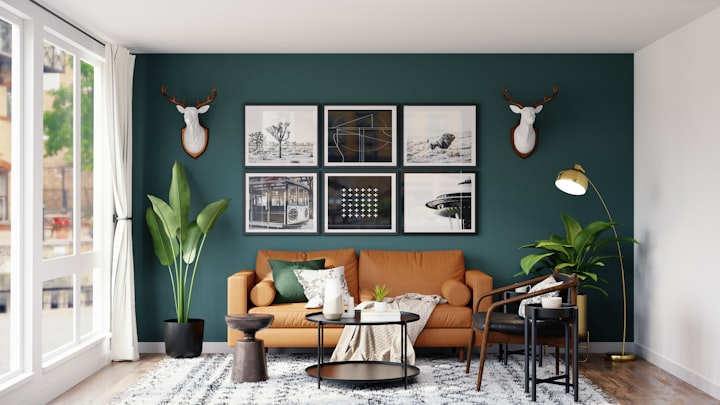
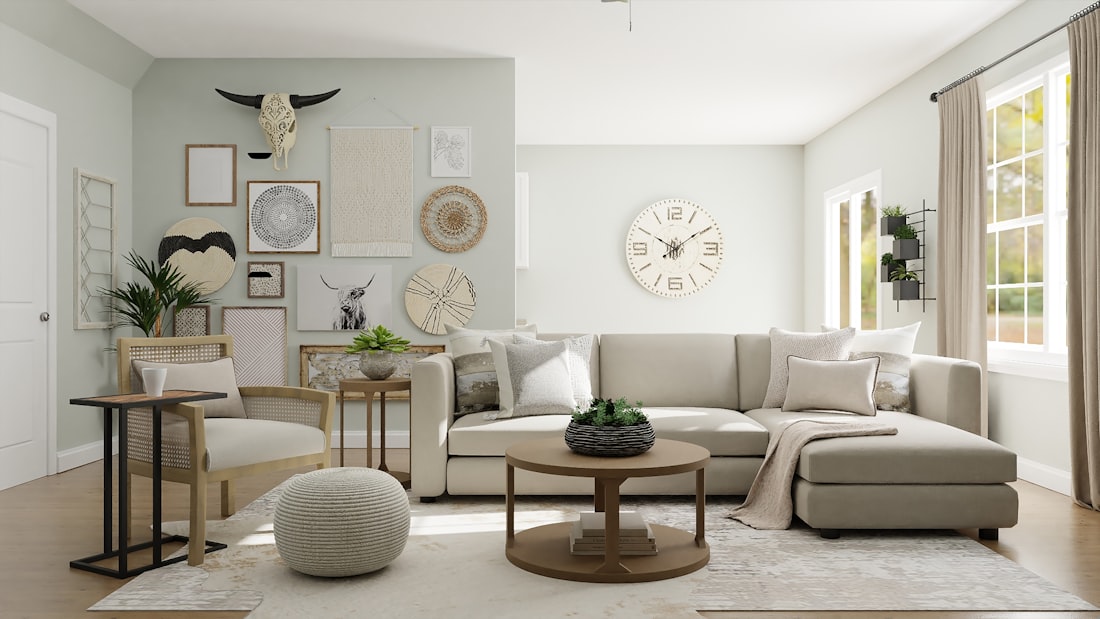
Curated wall decor is the headline for walls in 2026: not one lonely print, but a whole wall with a narrative — a gallery wall, a woven hanging, a plate wall, a mix of frames around an older mirror. The point is the mix: mixed sizes, mixed frame colours, mixed content (art, photos, postcards, small objects), but arranged with some order to it.
The renter version runs entirely on no-drill kit: picture rails or adhesive picture strips for light frames, damage-free hooks for a hanging, a leaning shelf for art set against the wall (some hung, some leaning gives better depth). For load ratings and reading the wall, work from the chart in the no-drill note; the trick of laying the arrangement out on the floor and photographing it before you hang is in the colour note.
Three: colour drenching
Soaking a space in a single colour family keeps gaining ground, and the 2026 version leans deeper and warmer: olive green, brick red, deep cocoa. The full renter version — using fabric instead of paint — is in the colour note; here I'll only add one trend observation: the spaces the magazines drench most this year are bedrooms and small corners — which happen to be the two places a renter has the most control over. Starting from the area around the bed is the lowest-barrier way in.
Four: warm earth tones and old pieces
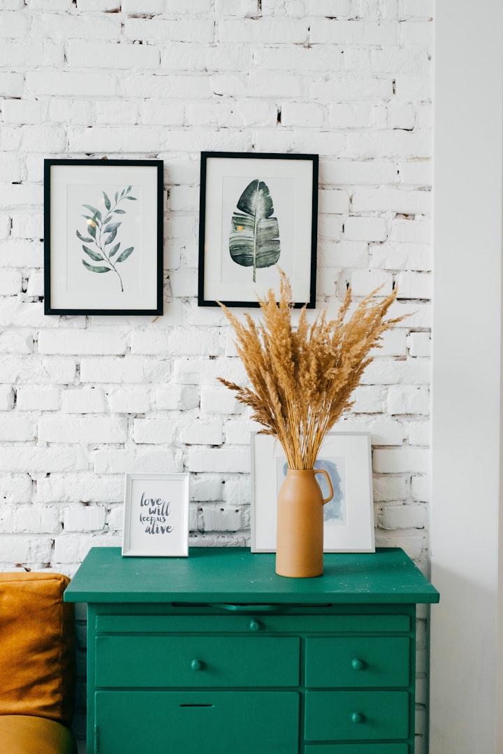
The 2026 palette in a phrase: warm neutrals (oatmeal, mushroom, warm stone), earth tones (terracotta, ochre, brick red), deep botanical greens (olive, sage, forest). The logic is simple — these colours all come from the ground, so they're natural companions and they're hard to get wrong however you mix them.
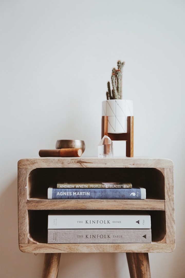
Coming back alongside the palette: things with some age on them. Brown wood furniture (the kind written off as fusty a few years ago), brass, rattan, pieces that show some wear. The magazines call it patina. That's doubly good news for renters: solid-wood older pieces have swung from "dated" to "desirable" on the secondhand market, and the prices haven't fully caught up yet — dig around using the secondhand logic in the furniture note, because right now is a good moment.
Three rules for living with trends
- Bring in one at a time. Pile maximalism, colour drenching and a gallery wall on at once and the room becomes a battleground of trends. Pick one, live with it for three months, and add the next only if it survives.
- Test with small things first. Want to try brick red? Buy the cushion covers before the sofa. The cost of testing a trend should sit at tens, not hundreds.
- Classic base, trendy surface. Buy the "base" — bed, table, chair, storage — in neutral classics that wear well (the reasons are in the furniture note), and put all the trend on the "surface" — fabric, art, small objects. When a trend cools off you change the surface, not the base, and the loss stays small.
Scaling it down for a small flat
The trend photos assume a large living room; a lot of us are working with a studio or one room. Three scaling factors:
- Take "more" down a notch. Layers saturate faster in a small space — where a magazine room sets out ten things, six or seven gets you there. Better to rotate in batches (swap the art and cushion covers with the seasons) so the room stays fresh without overflowing.
- Pick materials for your climate. In a warm, humid place, rattan, cotton and linen beat heavy velvet and long-pile rugs — they breathe, wash easily and don't grow mould in a wet spell. Handily, rattan is right there on the trend list anyway.
- Rescue deep colours with light. A dark palette in a dim flat needs enough warm light to carry it (see the lighting note), or "moody" slides straight into "gloomy".
One honest last word: trends are for borrowing inspiration from, not for sitting an exam. The best thing about 2026's trends is that they finally admit something renters have always known — a home's personality was never in the walls; it's in the things you bring into it.
Common questions
Won't whatever trend I follow now look dated next year?
The surface dates; the base doesn't. Buy on "classic base, trendy surface" and when it cools off you swap a few small pieces and you're up to date again.
How much do I need to spend to follow the 2026 trends?
Start for under about a hundred: one hanging fabric, a couple of earth-toned cushion covers, a few secondhand frames. The core is a curator's eye, not budget.
What's the actual difference between maximalism and mess?
A unified palette, a story behind each piece, a bit of breathing room — all three is curation; none of them is hoarding.
Is Scandi minimalism over?
No — it just went from "the answer" to "the base". Keep the empty space and the function, add warm colour, older pieces and texture, and that's the 2026 look.